Elle n
We did the brand design and interior art direction for ellen cafe and eatery Sydney. The logotype is based on a basic font, using two letters 'l' to bridge two 'e', one from 'cafe' and one from 'eatery' to match the brand name 'ellen'. In another form, the logo keeps 'elle' and 'n' and removes the rest but also keeps the space in between. This form integrates ellen into a soft embrace, also representing from the early morning to night, 'e' to 'n', which reflects the opening hours. There is a slightly inclined angle of the letter 'l', which follows the facade feature of the cafe to convey the humility and affinity of the brand image.
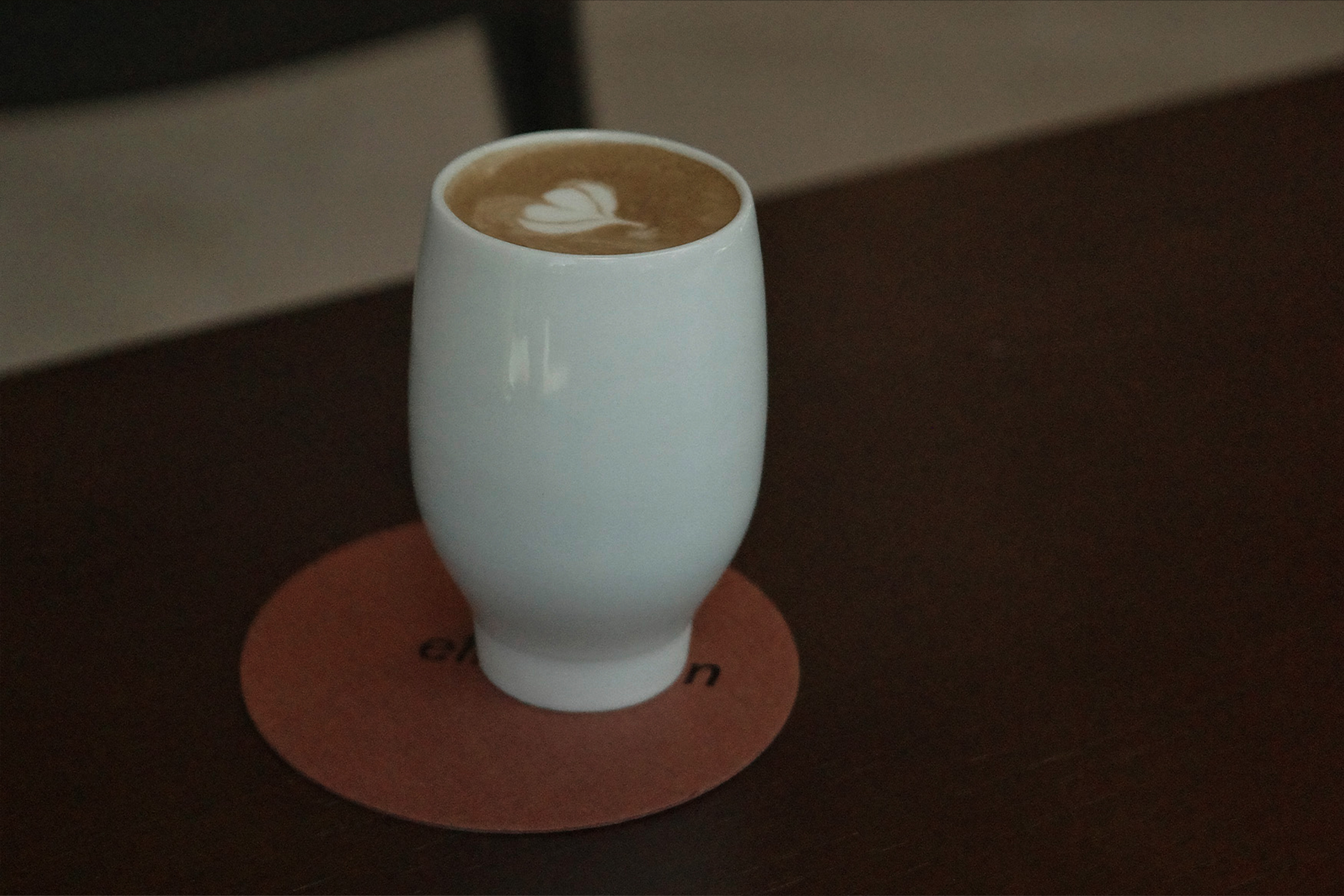
For the interior and styling, we chose a warm colour as the main palate, travertine countertops are matched with Tasmanian wood and the brand's signature brick-red leather. The open ceiling and kitchen connect the chef and barista directly with the diners aiming for smooth immediate communication.
For the interior and styling, we chose a warm colour as the main palate, travertine countertops are matched with Tasmanian wood and the brand's signature brick-red leather. The open ceiling and kitchen connect the chef and barista directly with the diners aiming for smooth immediate communication.


Client Ellen cafe and eatery
Designer Tian Na, Herbr Lin
2023