Ceremorning
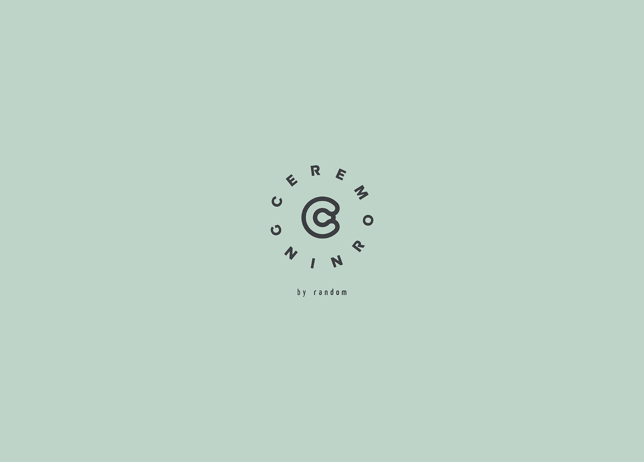
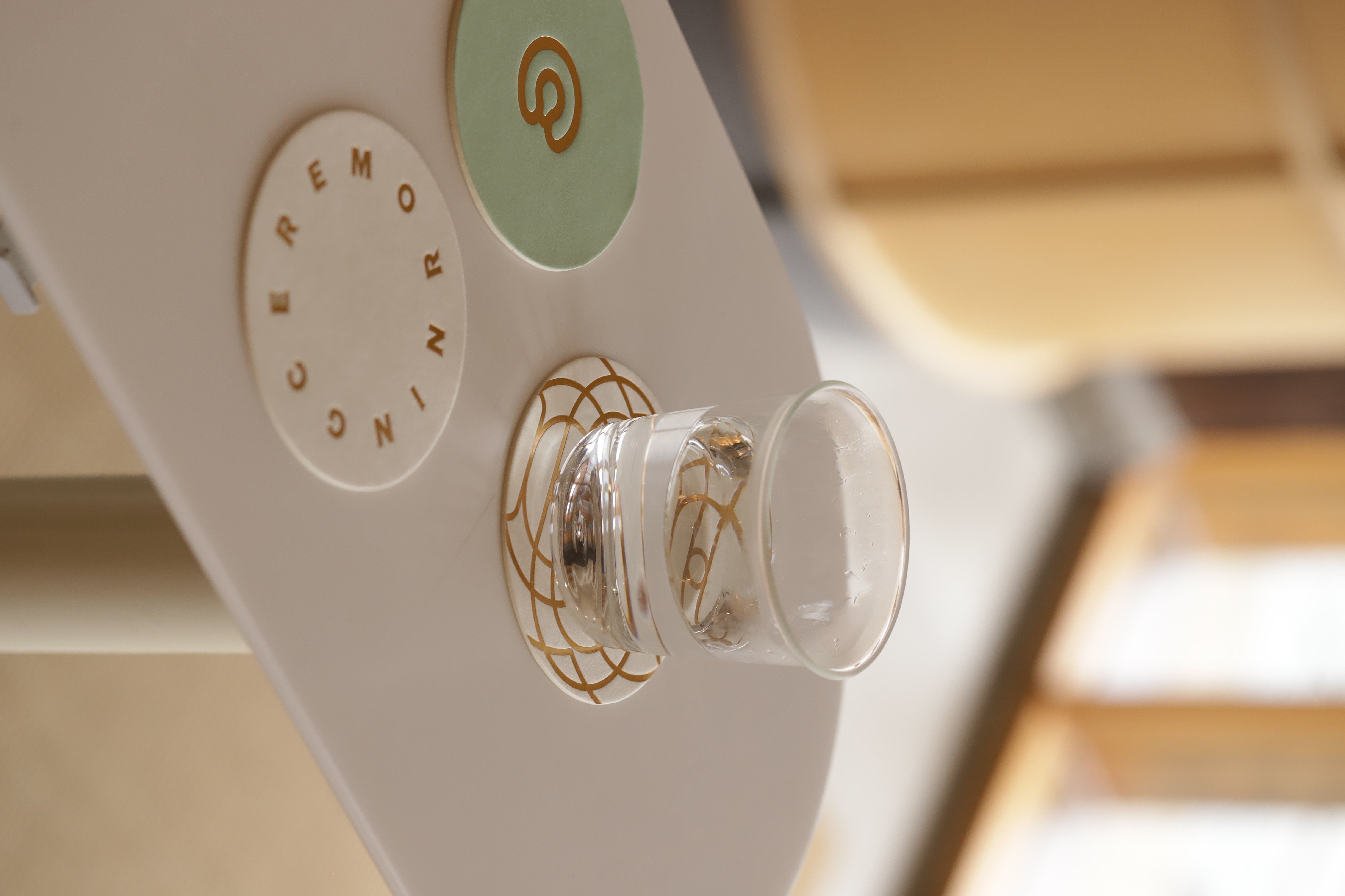
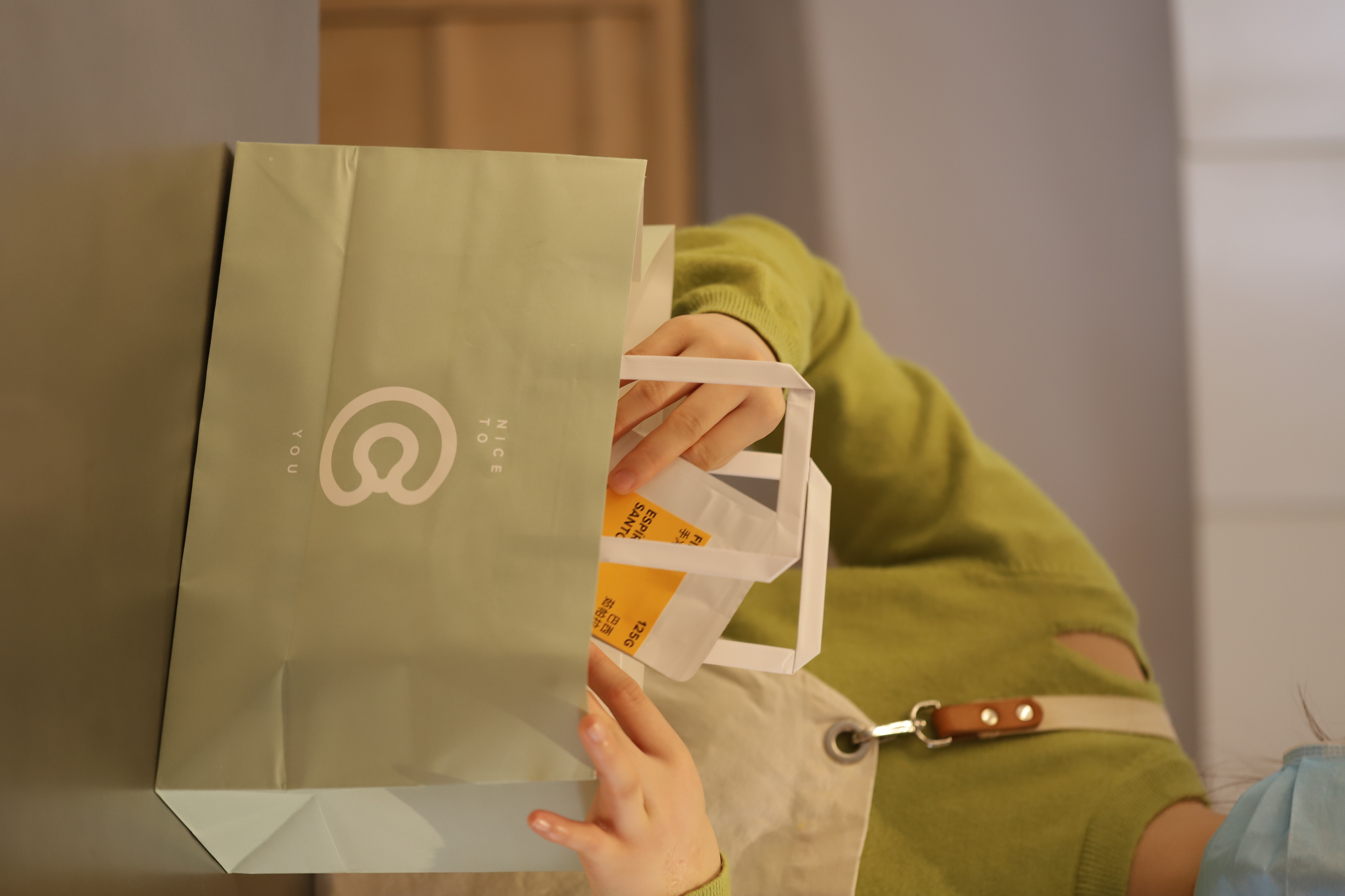
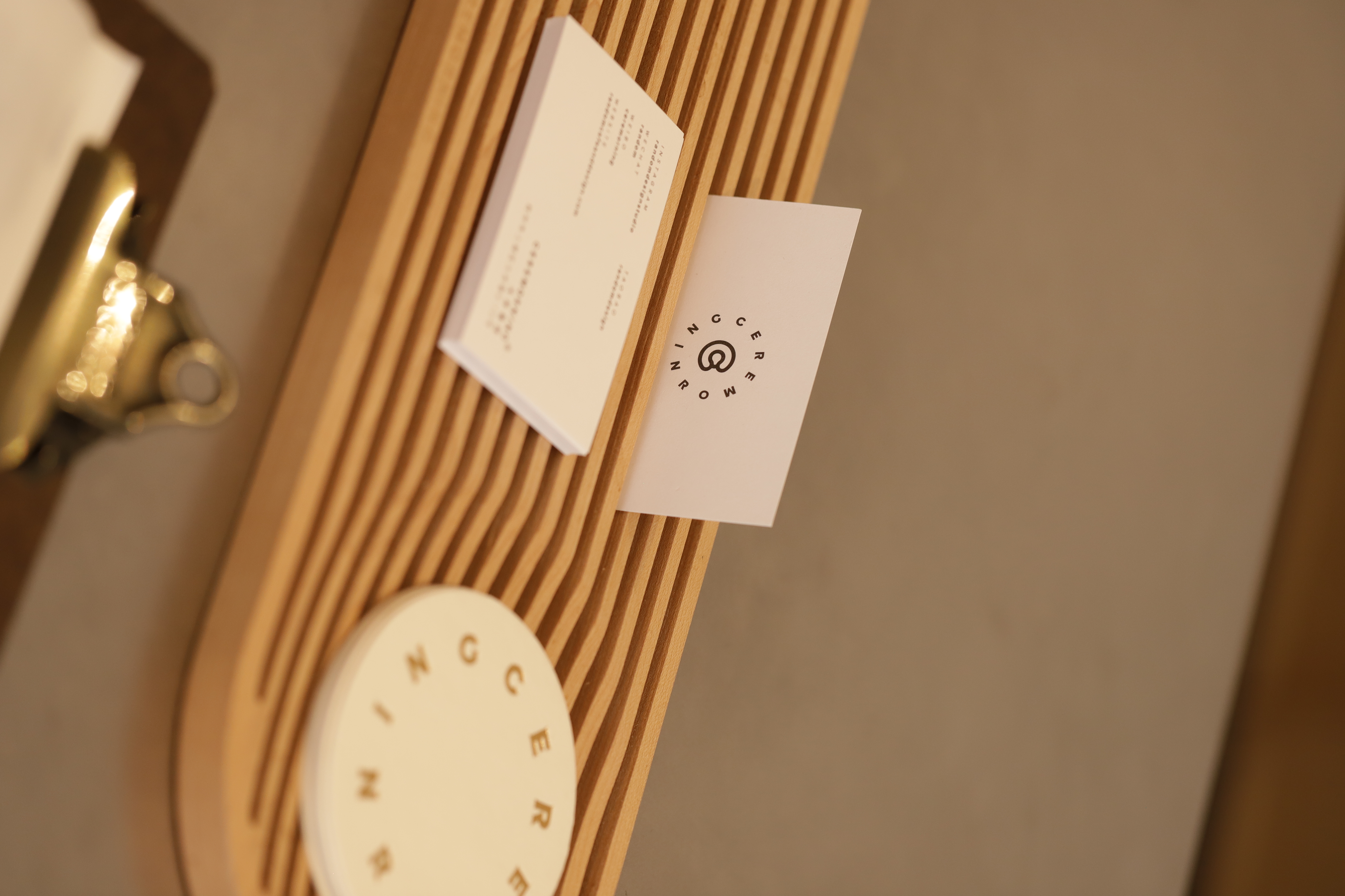
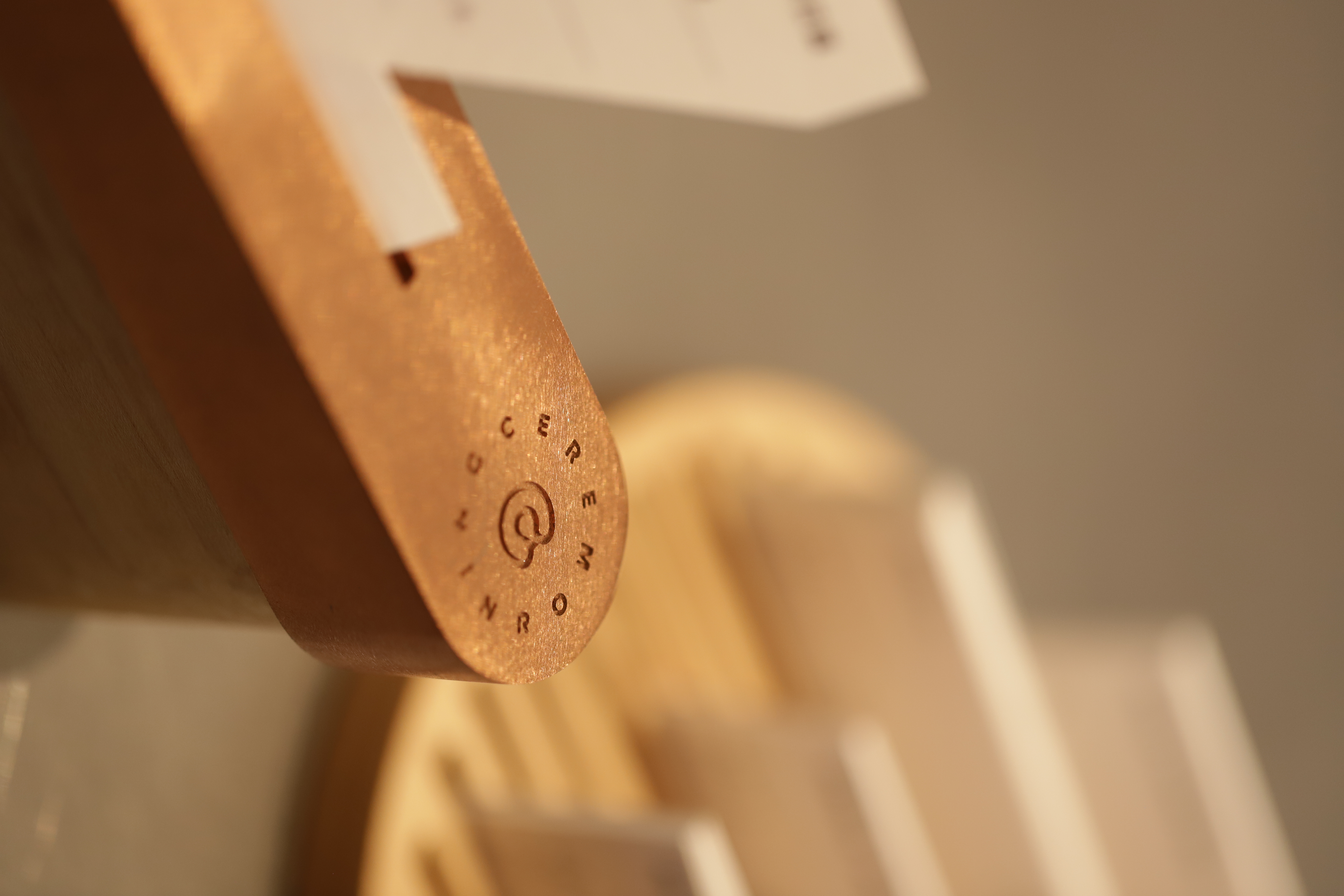
The brand logo of Ceremorning is designed based on its brand name initial “C”, by creating a closed fingertip touch gesture to represent a constant pursuit of perfection and a good desire for tangible happy moments. The special green is chosen as its brand colour to express the brand's guidelines of organic and natural life, it is also confirmed to use as the final material colour standard after many sampling and proofing tests. The whole branding now flows in their physical space, making the entire store exude visual charm and neatly integrated with the interior.



Designer Tian Na, Herbr Lin
2019